UX Analysis: Otherworld Heroes
Otherworld Heroes is a Free-to-play, location-based, mobile game by Goodbye Kansas Group (Virtual Brains). I have analyzed their current UI/UX. On this page, I will describe some pain points I have found and how I would solve them.
Page Content:
My first Impressions of the UI and UX
Three UX problems and my suggested solutions
Select one of the three described UX problems and visualize the solution (Using the UX tools I find most efficient in this situation)
First Impressions
Otherworld Heroes has a well-made UI that reminds me of Blizzard games. The icons are white and have a black outline; they look quite different from the skeuomorphic style UI. I understand that it’s probably a legibility choice, but I think there is an in-between, where the light hits the icons, or the white is slightly tinted.
UX-wise, some small tweaks would take the player faster to their goal. For example, when the player taps the plus button next to the coins, they go to the store, but diamonds are on top by default. If the store was sorted by coin or diamonds depending on which plus-button they clicked, this would save the player time. Another example is while looking for clans, most of them are locked, and the player must scroll before finding a clan that they want to join, which is unlocked. The possibility to filter out all clans that the player can’t join would save them time.


1/3.
Distinguishing Hero XP and Weapon Condition
The Character’s XP meter is represented in the same way as the weapon condition. Both have a skeuomorphic round iron frame and a light-blue, circle-shaped bar around the icon/character. This could create confusion since the visual similarities imply that the elements function in the same way. If a player sees that the XP meter is filled as the player gain experience, they might expect the weapon meter to behave in the same way.
Suggested Change:
A small change would break the expected relationship between the two elements. Changing color would help, but ideally, I would like to not only rely on color for accessibility reasons. Patterns, textures, and changing the shape would make sure that colorblind players can tell the difference between the meters. I would keep the iron frame since that is a button style that lets the player know what’s clickable.
2/3.
Define the borders of the Interaction Radius
To interact with an enemy, it must be within the player’s vicinity or Interaction Radius. The interaction radius is green and circular (see image) and it’s only visible when the player taps an element outside of it. This means that if the player hasn’t tapped an element outside of the radius, it’s hard to tell what they can reach. The only way for the player to see if an enemy is in reach is by looking at the enemy's health bar; once they enter the interaction radius, the health bar appears (See image, the enemy health bar is red). This is elegant because it implies that it’s possible to fight them, however, it’s not sufficient because there are more important aspects than when an enemy is entering the interaction radius.
Another important aspect is to know when an enemy is about to leave the interaction radius. The player regains health over time. Sometimes the player will be hurt, and want to regain as much health as possible before entering the next fight, however, if they wait for too long, the enemy will leave radius. It’s hard to predict when this will happen because the indicating circle only appears when the player taps interactive elements outside of the radius (that isn’t visible). This is not ideal, because the player must look for interactive elements outside of the radius while keeping track of the ememy’s position and their own health bar at the same time. This is cognitively too demanding for a casual mobile player.
Suggested Change:
The easiest solution is to have the interaction radius visible at all times. If the green circle is too aesthetically disruptive to have present on the screen at all times, it could be reskinned, for example by making a visual difference between the area outside and inside the radius. Making everything darker (or blue-tinted) could be a more elegant solution. This would declutter the screen by removing the focus from elements far away, it would help define the interaction radius and create a feel of mystery that would fit the feel of the game.


3/3.
Make it Easier to Find a Recipe
The player can craft potions with different abilities. To craft a recipe they first must choose the category of potion they what to create. It can be hard to understand what potions the different categories in the Crafting area cover. It demands attention to read the labels and remember where the recipe I want lives. Some categories also share properties and can be hard to tell apart, for example, “Heal over time“ and “Direct Healing“.
Suggested Change:
By exposing the content inside the categories, the player wouldn’t need to figure out what the category names meant. I would suggest replacing the category buttons with tabs. The problem is that seven tabs are too many, and using a dropdown would require too many taps. To solve this, some of the categories could be combined, this would reduce the number of tabs to “Health“, “XP“, “Exploration“ and “Combat“. Adding an icon on the potion bottle could also help improve the instant understanding of its functionality.
I decided to explore solutions for this part of the UI. You can read more about my suggested solution in the next section.

Process
I started by making flows because the pain point was in the hierarchy. By removing one step from the flow, it would be possible to expose the recipes directly, without having to go through the category screen. This way we could reduce the cognitive load that the category list created and at the same time reduce taps.
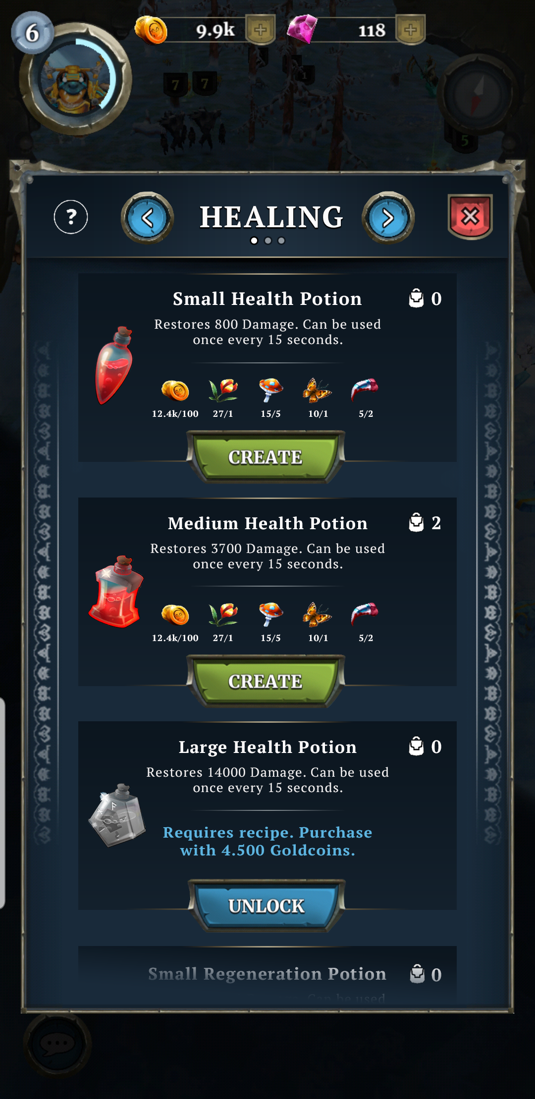
Mockup: Recipe List
When the player taps “Crafting“ they now go to this screen instead of the categories. Here they can vertically scroll through the recipes in the selected category. If they want to change category they can either tap the arrows next to the title or swipe left/right. Underneath the title, page indicators show the number of categories; this will help the user to understand when they loop back to the first category and make navigation easier.
On this screen, the player can see the most important information: Name, required ingredients, number in inventory, and a brief description of its effect. I chose to reduce the visual importance of the description because a long description is not compatible with a casual player. I believe that the image of the potion will be the most important information about the potion’s tier, the larger and more visually intricate it is, the better it will be. The name and description are there, but I don’t expect most players to pay attention to it.
I changed the color of the info text on the locked recipe to match the color of the button to create a stronger association between the button and text.