
UI/UX Redesign: PUBG
I recently started a project where I’m going to redesign UI from games that exist. This is my redesign of Player Unknown’s Battlegrounds in a sci-fi style.
UX
Wireframes

I started by re-creating the UI in wireframes. I made them very simple and minimal minimal to help me understand what was working and what I wanted to improve. I discovered that I wanted to change the structure of the content. There's a natural division on the page; the character image, and I wanted to utilize this more. I could not find good overarching names for the sections on each side of the character, and I figured this was because the content on each side didn't belong together. If I could improve the structure of the page, the information would be easier to grasp for the player.
Groups and Hierarchies

On the left side of the character, I wanted to isolate everything that was available to the user at this point; vicinity and inventory. On the right side of the character, I put everything that the player had equipped (including armor, backpack, and clothing).
The clothing is important for the players, but not at this point in the game. The player opens the inventory at all times in the game, and they have to make fast decisions on how to improve their character's equipment or health. I put clothing to the far right of the page to free up cognitive space for the most important elements.
Bag Meter
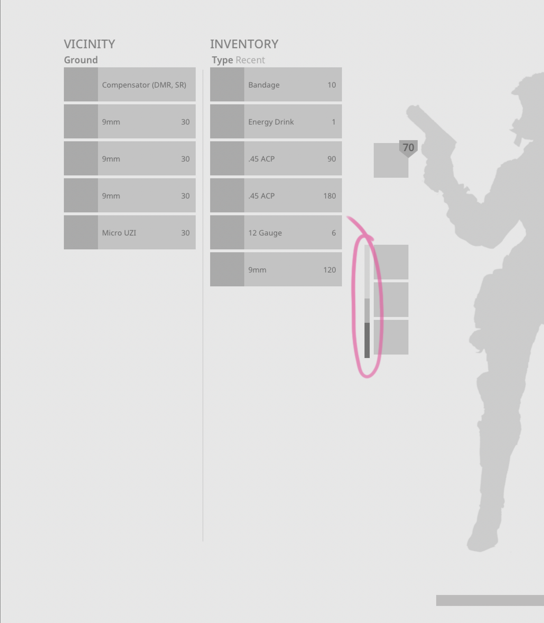
The bag meter is useful, but it's still hard for the player to understand the relationship between an item's size/weight/amount and the size of their bag.
Empty Slots
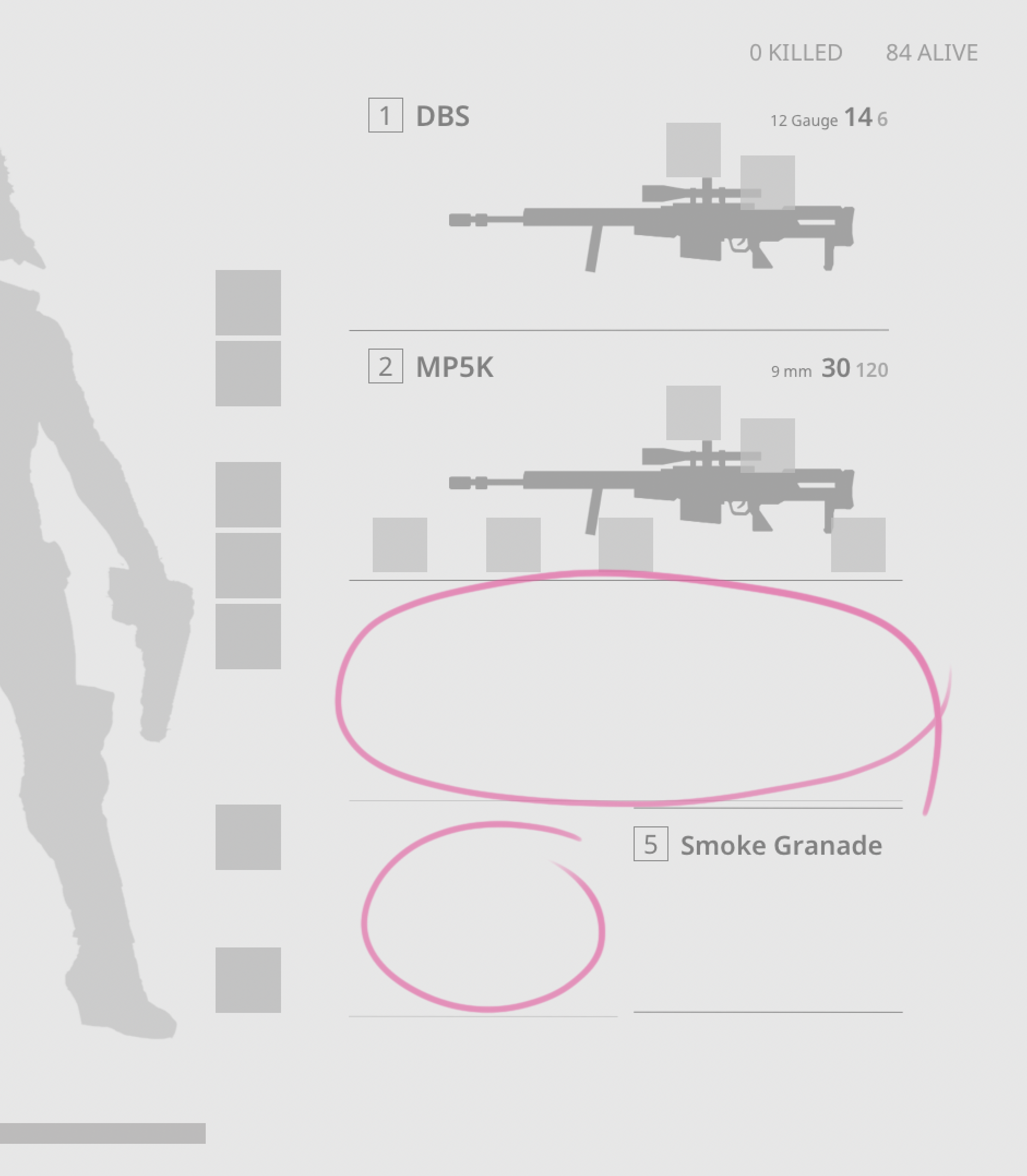
The empty weapon slot is only communicated by empty space in between two lines. This is not a problem for experienced players, but my goal is to create a self-explanatory UI to make the game accessible and minimize the need for tutorialization.
My Wireframes
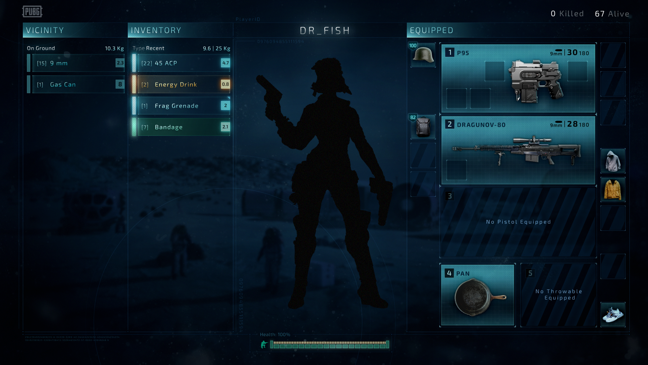
I placed the most used elements (inventory, armor, and weapons) closest in the center to reduce the mouse travel when moving objects to new sections, but also put the most important information in the focal area of the screen.
Instead of the bag meter, I show the weight of objects and the maximum weight to the inventory header. The main issue with the bag meter was that the user couldn't know the weight/volume of an object before they added it to the inventory and then observed how this affected the bag meter. I decided to expose the weight to help the user understand what they were able to pick up. Players can't rely on their senses when estimating the size of an object, and as designers, we have to provide them with enough information so that they can make good decisions.
I numbers to all slots, even the empty ones. The numbers relate to the keyboard shortcut, but as long as it's clear that there's no weapon in a numbered slot, this should not create confusion for the player. More defined slots with numbers at all times gives the user a better overview of how many weapons they can equip.
I added text in the empty slots to provide information about what type of weapon that goes where. For example, in the third slot, it now says "No Pistol Equipped" to guide the player.
UI
MOODBOARD

I wanted to create a modern, glowy sci-fi UI. I collected images and here are some of my takings:
The grid should be clear. This will help the user understand their limitations and it also fits with the genre.
All images have dark backgrounds and glowy blue/green containers.
In the selection of images the ones with thinner lines appeared a bit more elegant and light.
Text with gradients gave them more feeling without taking away from the readability.
Thick diagonal lines are a great way to bring attention to when something is missing.
I used my references to create this UI. I started by making the basic shapes in Illustrator and Photoshop. Then I refined them using layer styles in photoshop. In the end, I added grain, lens grunge, and other textures.

Color Coding Functionality
A small change that I haven’t touched on is that I decided to color-code the objects after their functionality. It’s never a good idea to rely on color, but it can be a "nice-to-have". In this case, it’s not crucial to see the colors, but it helps players to determine functionality without reading. Energy drinks here have the same color as the stamina bar, and the bandages have the same color as the health bar.

Clear Slots
Here's a side by side comparison of the equipped section. The diagonal pattern in the redesigned version helps to define the empty slots. They also have embedded text so that the user understands what weapon they add here.